Please use the following Notes


Forecasting is the application of Predictive Analytics.
Wherever we have a forecasting problem we would be using a time series data.
Time Series data is a data on a response variable, Yt observed at different time points t.
Yt eg. Sales
Time series Data has the following Components
Trend Component (Tt)
Trend is the consistent long-term upward or downward movement of data over a period of time
Seasonal Component ( St)
Seasonal Component is the repetitive upwards or downward movement from the trend that occurs within a calendar year.
Festival, School Holidays, EOSS
Constant periodicity
Cyclical Component ( Ct)
Fluctuation around trend line that happens due to macro economic changes such as recession, unemployment
They have repetition of more than a year.
Non Constant Periodicity
Irregular Component ( J)
It is the white noise or random uncorrelated changes
Follow a Normal distribution
Mean value 0 and constant Variance
Seasonal Component


Notes: Mean squared Error depicts how much wrong we are in our forecasting. This is given by:

Ideally it should be 0, else it should be as low as possible.
Case
SareeGhar is a company that sells silk sarees. Ragini is the category manager of sarees. She has data of 24 weeks of saree sales as given below:

2. Make the y -axis start from 25 to 45, and x-axis from 0-25. the graph should look like:
3. Change the y-axis units to 1 week instead of 5 weeks.


The most important decision in MA is the number of periods (k):
If k is too small, then the average tens to be more responsive to the recent trends.
If k is large then the forecast is less responsive to recent changes.
Here value are even, we find the rep value in 2 steps,
For odd values, there is no issue.
So moment I get the 5th week data I use it in place of 1st week data.
It is different from moving average forecast.
In this case we are doing the MA, for the purpose of finding the rep average for the period
For 3 period, it is easier, I take an average of Y1, Y2, Y3 and place it against Y2
8. Forecast it using the Singe Exponential Smoothing test with alpha of 0.1 and 0.9
SINGLE EXPONENTIAL SMOOTHING
We use it for data which is fairly steady with time, with no significant trends- seasonal or cyclic components.
Here the weights are assigned to the past data, that decline exponentially and more recent observations are assigned higher weights.

It uses whole of the historic data, unlike MA where only past few observations are used.
Disadvantage
Increasing alpha makes forecast less sensitive to the data
It Always lags behind trend as it is based on past observations.
Forecast Bias and systematic errors occur when the observations exhibit strong trend or seasonal patterns.
Choosing alpha
When the data is smooth, we choose higher value of alpha
When the data is highly fluctuating, we choose lower value of alpha
We can use Solver to choose alpha with Constraints 0<alpha<1


Why Smoothing:
Smoothing is usually done to help us better see patterns, trends for example, in time series. Generally smooth out the irregular roughness to see a clearer signal. For seasonal data, we might smooth out the seasonality so that we can identify the trend. Smoothing doesn’t provide us with a model, but it can be a good first step in describing various components of the series.
DOUBLE EXPOENENTIAL SMOOTHING- HOLT's METHOD
One of the drawbacks of single exponential smoothing is that the model does not do well in the presence of trend. This can be improved by introducing an additional equation for capturing the trend in the time series data.


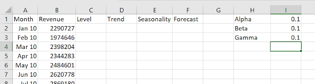
The data depicts revenue of sarees across years.


So first we set up columns like this:
Now if we look at the graph, the values are after every month, but patterns repeat after every year, so we take the seasonality as 12.
So we need 12 seasonality factors for initialization. So for that we leave out 12 period of level and trend.
So we calculate the seasonality of jan10 as the actual value of y minus the average of entire year.

We copy the formula to the first 12 seasons. As there is no forecast for those. Just copy blank in the forecast as well.
For Dec10, we simply take trend value as 0 and Level value as difference of Dec 10 actual value and Dec 10 seasonality.


Now for Trend we go with this formula


We copy it over. Now forecast is also simple, it is the sum of all the previous level and trend and the previous same season

Then we calculate MAPE


MAPE: Minimize
Changing Values of : Alpha, Beta and Gamma
Constraints: Alpha beta and gamma are between 0 and 1 inclusive


Lets forecast for a year
So we write 1 to 12 in column G


We use the Dec 19 Level forecast + The order of forecast ( which is 2 written on the side) + previous value in the corresponding season.


We Change the seasonality formula to this, and copy to the first 12 months.

We change the Level formula from Jan 11 as follows:

There is no change in the trend element. In seasonality element, instead of subtracting, we divide


We change the formula of Feb 2019 as follows


The MAPE we are getting is 0.026.
Now lets power on the solver and optmize the value of alpha, beta and gamma


It is a comparison between Naïve forecasting model and the model developed.
In the Naïve forecasting model, the forecasted value for the next period is the same as the last period's actual value.

It is basically the ratio of : MSE of the forecasted model/ MSE of the Naive Model
A value of U<1 indicates the forecasting model is better than the Naïve forecasting model
At U=0, the model is perfect
A value of U>1 indicates that the forecasting model is no better than the Naive model
10. What is the Power of the forecasting in the last excel sheet. What is the U coefficient that we got. Interpret it.
A value of 0.54 of U coefficient is good as it is twice better than 1.
Case I: Seasonal Variation
Before we introduce the seasonal variation, let me introduce you with one more metrics to measure the effectiveness of forecasting. This is called MAPE ( Mean Absolute Percentage Error). It is calculated by

It is one of the popular forecast accuracy measure. Since it is dimensionless, we can use it to compare different models with varying scales.
Lets consider this data:


19%
To capture seasonality, we introduce seasonality index.
We need to capture the seasonal Component into our forecasting. How to do it:


From there we calculate the Seasonality index.
Seasonality Index for 1st week of the 4 week cycle= SR component ( 1st + 5th+9th+13th+…)/ count of values
Seasonality Index for 2nd week of the 4 week cycle= SR component ( 2nt + 6th+10th+12th+…)/ count of values
…. And so on.

Remember the Average of the Index should be 1. If not 1 we divide each value by the Average SI obtained
Now we use seasonality index to decentralize the data
So Decentralised Sales = Actual Sales/ Seasonality Index

Lets look at the plot now

Now we make a new Table


It is closely mirroring. It seems that we have done well.
Similarly If you have Trend
Moving average will capture the trend to some extent
In that case we could de-trend and deseasonalize
In that case you should de-trend and de-seasonalize.
In an exponentially growing organization, capture the trend using regression.
Case I: Capturing Trend ( Regression)
In this case , we are saying that each of the weeks are different. So time is a variable. We can take base variation as week 1.
So we set up the table as:


Interpreting: 52 is the average sale of the first week.
Wk 2 sale is 30.9 more than that of first week
Wk 3 sales are 20 more than that of week 1
Wk 4 sales are 20.2 more than that of week 1
Lets exclude week and running regression again.

MAPE Turns out to be 4.04%, over there it was 5%. So regression gives you better estimate.
Case 1: Capturing Trend as Well As Seasonality
Look at the Sales Data 3


So first we:
1. We Deseasonlize the sales.
2. Do the trend forecast
3. Reseasonalize the sales.
After deseasonalization, we get the following curve:

Pink line is deseasonlised sales but it is still showing the trend.
I take the deaseaonised sales and do regeression to detrend the sales and put it back.
To capture the trend, rather than using regression we, can use a function called TREND, and complete it using Shift ctrl enter

If we draw the chart now, it follows the values and hence we are able to forecast.
